- All
- Brand Identity
- Design
- Digital Product & Web
- Editorial & Packaging
- Poster & Art Direction
MAFE-PHOTOGRAPHY_b-identity_2025_ON
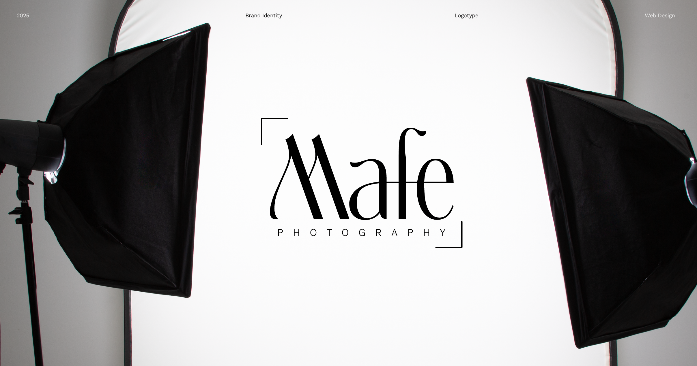
An identity designed for a multidisciplinary eye.
Mafe Núñez approached a transition as she prepared to expand her photography practice across European markets. Working fluidly between fashion photography, lifestyle content, and wedding work, her work naturally spans distinct visual environments.
Her main concern was a familiar tension for contemporary creatives: how to build a clear, recognizable identity across diverse practice areas without forcing her work into artificial silos or appearing fragmented.
2025
Bárbara Sendrea
Mafe Photography
2 months


The myth of narrow specialization
There is a common assumption in visual identity that specialization requires narrow boundaries. When a practitioner works across multiple fields, the market often perceives this breadth as a lack of focus rather than an expanded perspective.
Mafe initially sought a mark to anchor her new digital platform. However, addressing her positioning required looking beyond an immediate graphic response. The challenge lay in questioning whether standard branding conventions applied here, or if her identity needed to be framed around her personal stance rather than viceversa.
Monogram as a singular posture
We focused on her preferred name, Mafe—a moniker that carries both personal intimacy and professional authority. Rather than creating a graphic symbol that attempted to illustrate what she does, the project shifted toward developing a visual system around how she works.
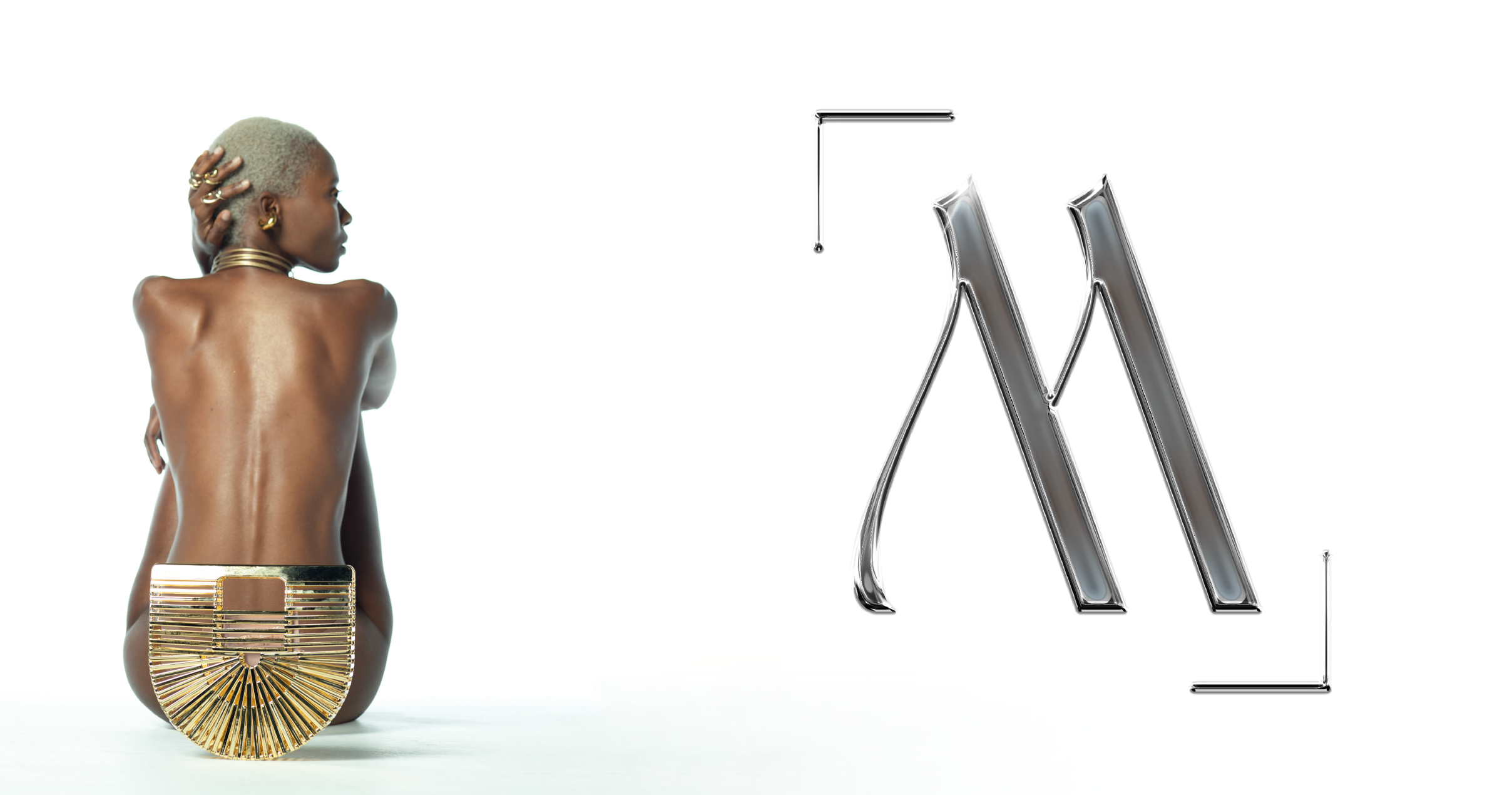
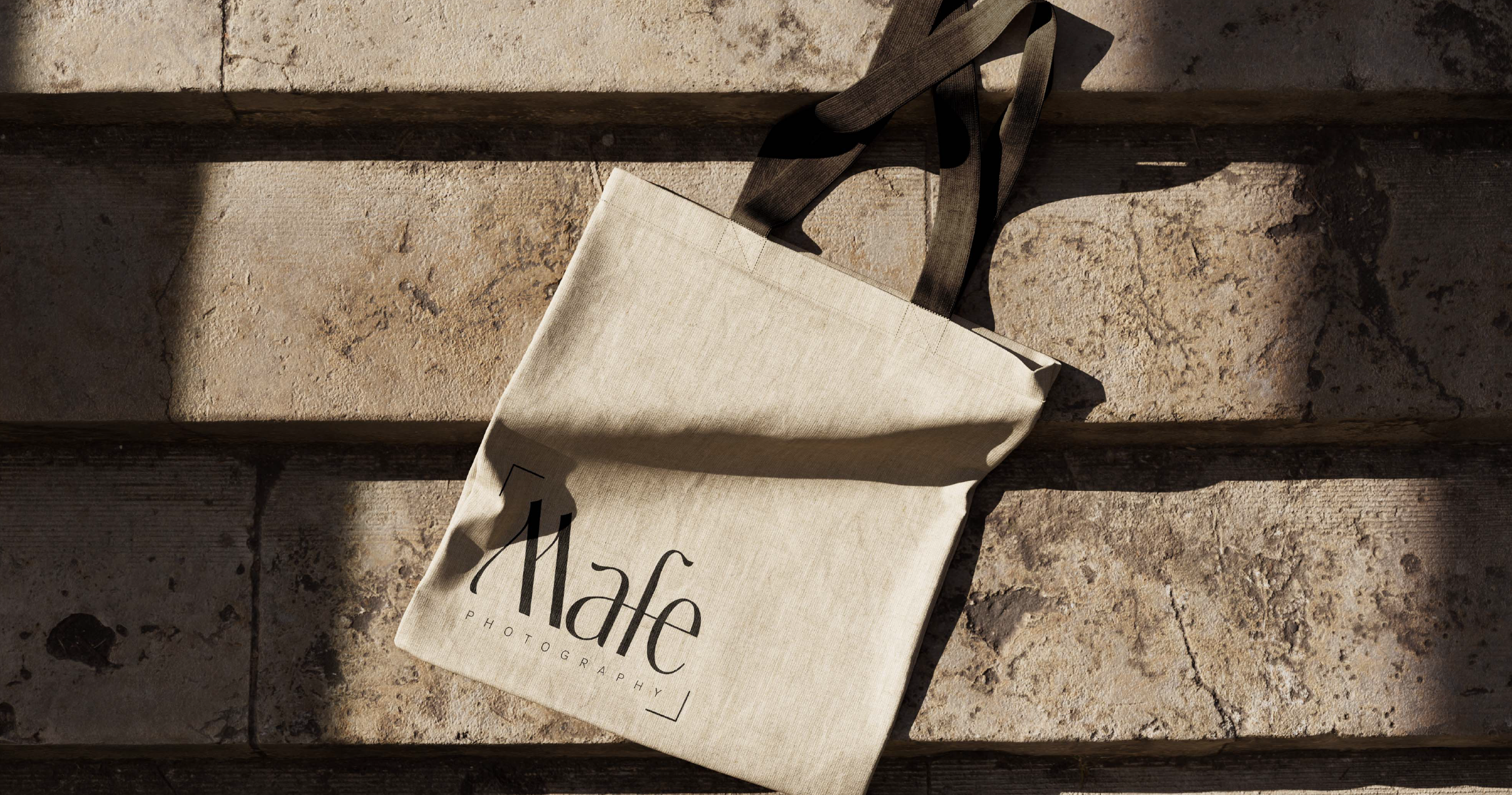
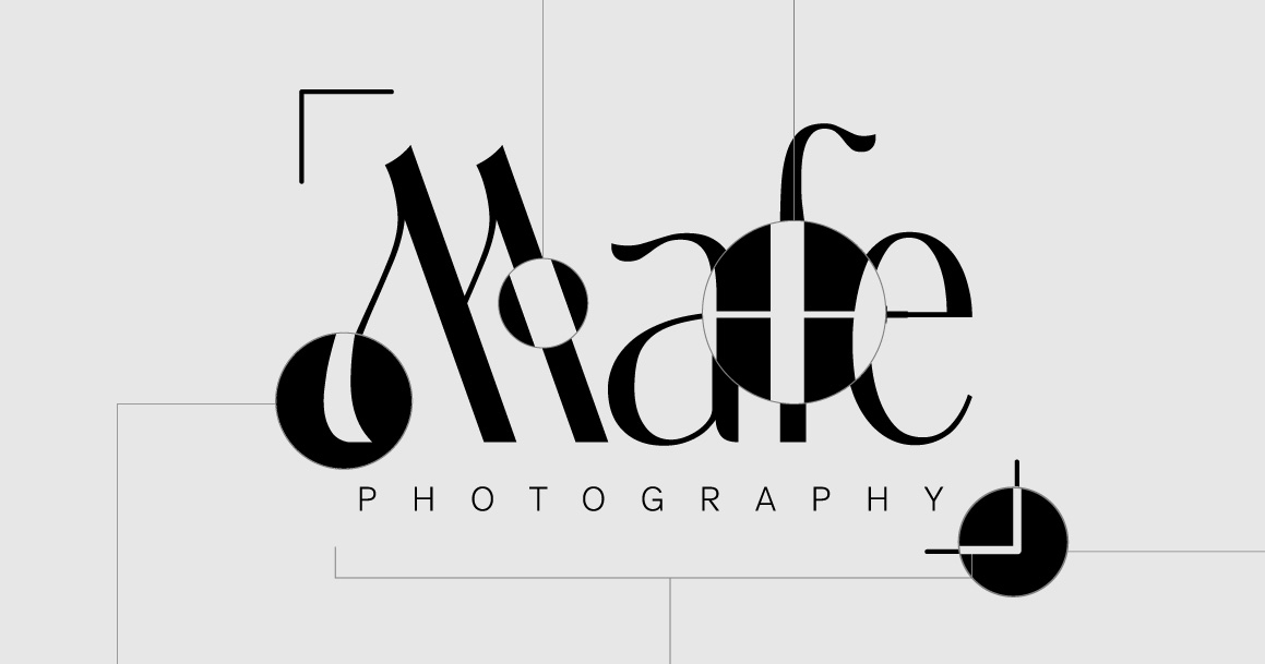
The design centers on a custom typographic mark where a single continuous gesture connects the isolated characters. This fluid connection serves as a discreet parallel to how her varied disciplines exist under one continuous artistic vision.
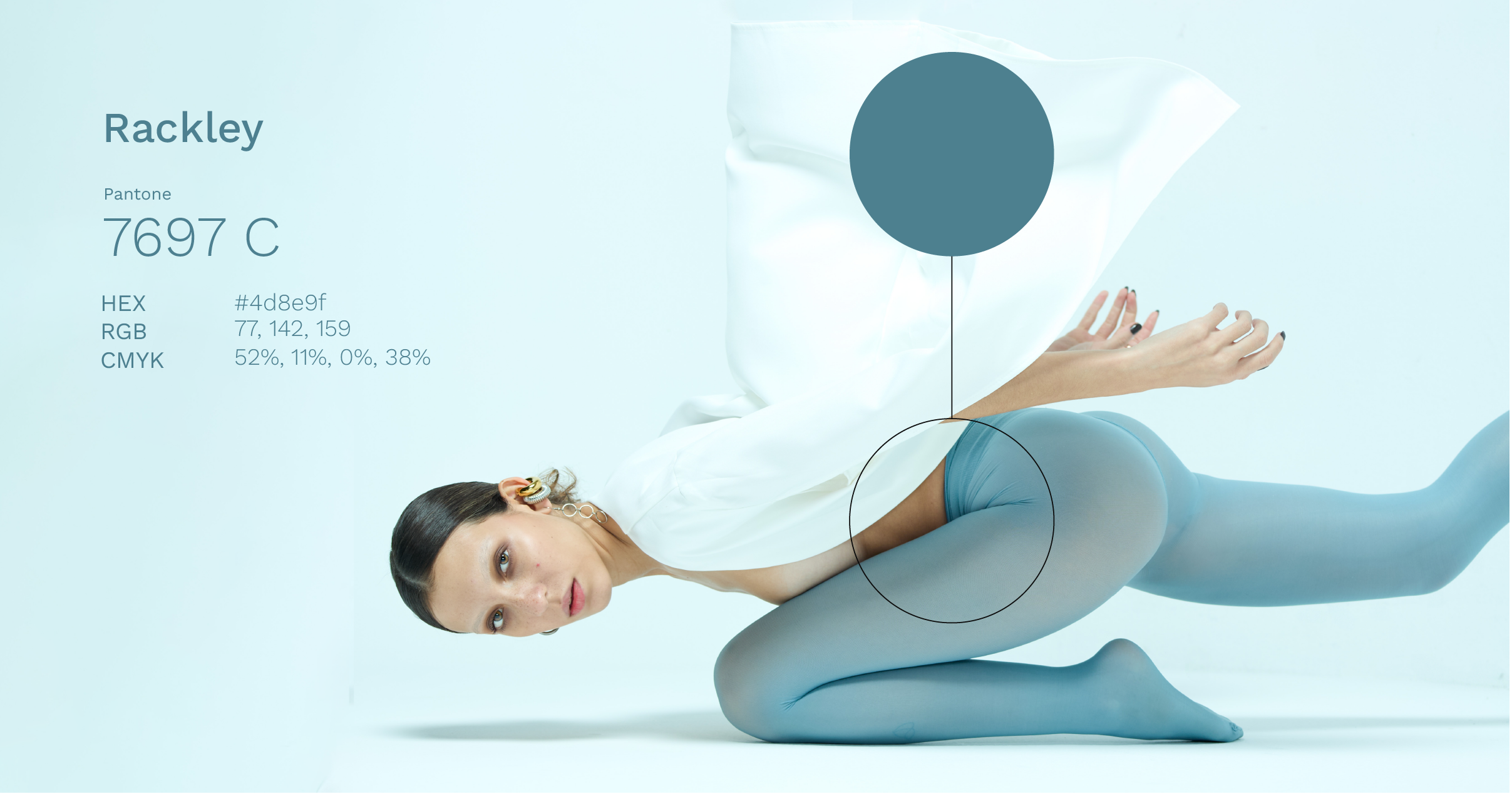
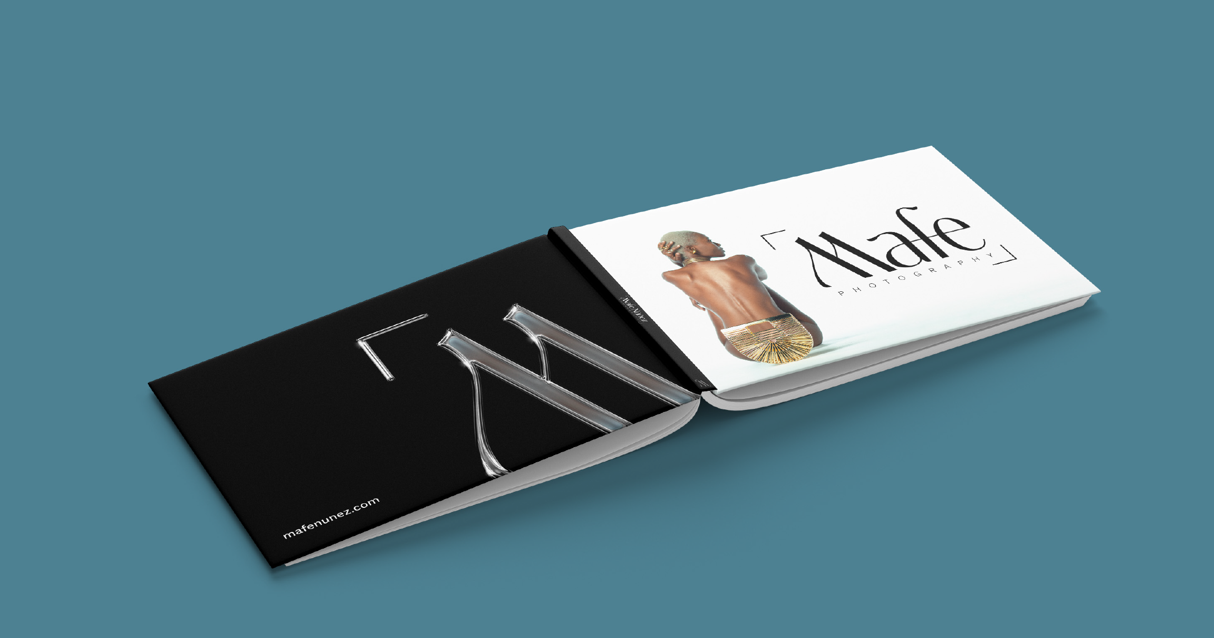
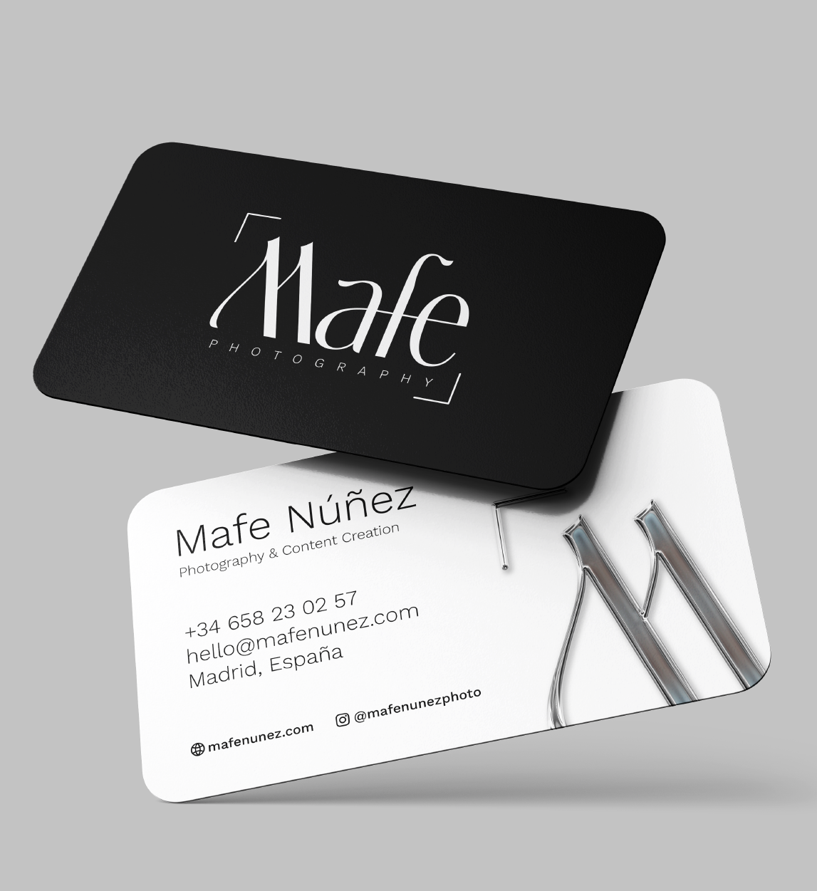
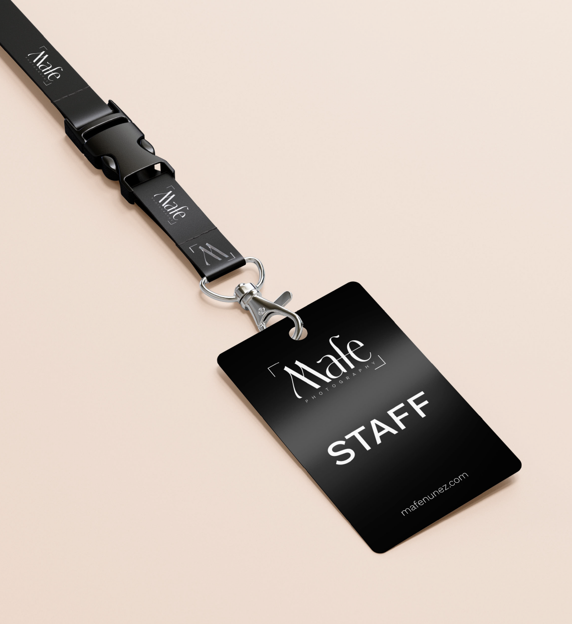
Rendered in a restrained monochromatic palette, the identity relies on typographic weight and proportion. The system was then considered across tangible touchpoints—from digital interfaces to practical physical applications like assistant identification, professional stationery, and functional equipment storage.
Uncovering the underlying need
This project served as a reminder that what clients identify as a branding need is often an invitation to examine underlying positioning. The solution frequently lives within the tension itself; rather than hiding multidisciplinary work, the system can frame that versatility as a singular viewpoint.
In practice, subtle typographic choices often hold more weight than explicit visual declarations. Taking time to listen and ask open questions during discovery allows the work to emerge organically from who the practitioner actually is, rather than who they think they ought to perform as.
"Trabajar con Oriana fue una experiencia de reflexión a la creación de mi marca personal. En todo momento estuvo muy atenta a mis necesidades, adaptándose y escuchándome en cada paso. El resultado fue íncreíble: una marca con la que me identifico por completo"
Mafe Núñez, Photographer
VUELA-FEST_b-identity_2025_ON
CASABE-CUPIRA_packaging_2025_ON
An identity designed for a multidisciplinary eye.
Mafe Núñez approached a transition as she prepared to expand her photography practice across European markets. Working fluidly between fashion photography, lifestyle content, and wedding work, her work naturally spans distinct visual environments.
Her main concern was a familiar tension for contemporary creatives: how to build a clear, recognizable identity across diverse practice areas without forcing her work into artificial silos or appearing fragmented.
2025
Bárbara Sendrea
Mafe Photography
2025
2 months
Web Design by Bárbara Sendrea


The myth of narrow specialization
There is a common assumption in visual identity that specialization requires narrow boundaries. When a practitioner works across multiple fields, the market often perceives this breadth as a lack of focus rather than an expanded perspective.
Mafe initially sought a mark to anchor her new digital platform. However, addressing her positioning required looking beyond an immediate graphic response. The challenge lay in questioning whether standard branding conventions applied here, or if her identity needed to be framed around her personal stance rather than viceversa.